Unveiling our new brand
We’re thrilled to unveil our new brand identity and website to the world!

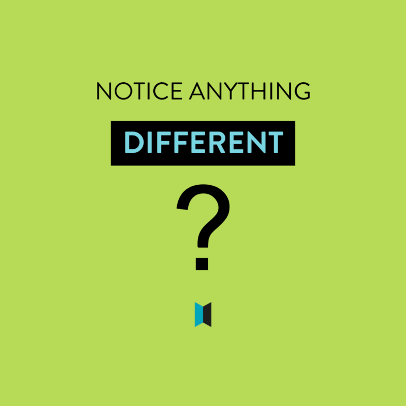
About our new look
So what does our new look mean?
Well, firstly, we’ve changed colour. Out goes the orange and in comes teal, coupled with black. It’s bolder and, in our new font, has a sleeker, contemporary look.
We’ve replaced the doorway in our original logo’s “O” with a more enigmatic door design.
It’s a subtle design device. Different people see it opening different ways (even we can’t agree on which side is the opening!). Some won’t even notice that it’s a door at all.
While we wanted the branding to look professional and reflect our values of tenacity and reliability, we didn’t want it to be too boring. After all, one of our priorities is that work should be fun. So, with this in mind, we have a secondary palette which includes this contrasting citrus green colour. You’ll see it popping up on our social posts in particular.
The journey to get here
When we originally started our business, back in 2017, we were called “Open Door Websites” and our focus was on creating low cost websites for small businesses.
Our branding reflected this, with an eye-catching orange colour scheme, reflecting the lower cost nature of our offering.

To be honest, we weren’t very good at living up to that brand positioning. We’d quote a nice low price to produce a basic website and then we’d get all these good ideas. And we wouldn’t be quite happy enough with the design. Or we thought we’d just add an extra bit of functionality. Oh, and let’s buy that expensive font to really make the design pop.
Of course, before we knew it, the client was getting a website worth at least twice what they were paying.
So we decided that ‘cheap and cheerful’ didn’t work for us – well, the cheap bit, anyway, we’re still pretty cheerful!
In 2018 we evolved to become Open Door Digital, reflecting a step up, both in terms of the quality of our work and the range of services we offered.
However, our logo fundamentally stayed the same.

But, over the last couple of years, we’ve come to realise that we’ve outgrown the cheery orange and need something that better reflects our brand values.
Working with Fay from Phase One Design, in 2022 we went through a thorough brand review, assessing what our brand meant to us and how this should be visually portrayed.
Fay bravely refereed the in-house arguments as we disagreed over our preferred design! Finally, we found our new look.
To compliment our new brand identity, we also engaged photographer Pippa Tanko to do a photoshoot which would bring our brand to life. You’ll see the results of this peppered throughout our website.
Finally, of course, we needed a new website which would bring all of this together.
To say this was a difficult birth is an understatement.
It’s amazing how much less clarity we had about creating our own website compared to developing ones for other businesses! And, of course, it’s oh so easy to push your own marketing work aside when there’s work to be done for clients.
However, after almost two years of development 😳 here it is, our new website.
And, like our new branding and photos, we’re immensely proud of it.