Services: Content, Web design
The brief
PJL Healthcare manages two homes in East Sussex, offering high quality care to children with complex needs.
When PJL Healthcare approached us, their website looked outdated and was frustratingly slow to use.
They wanted their new website to:
- Make it clear which children their specialist care would be suited to.
- Promote the benefits of joining the PJL Healthcare team.
- Reassure website visitors of the high quality of care throughout the organisation.
Finally, the website needed to be easily updated with news articles and job vacancies.

The solution
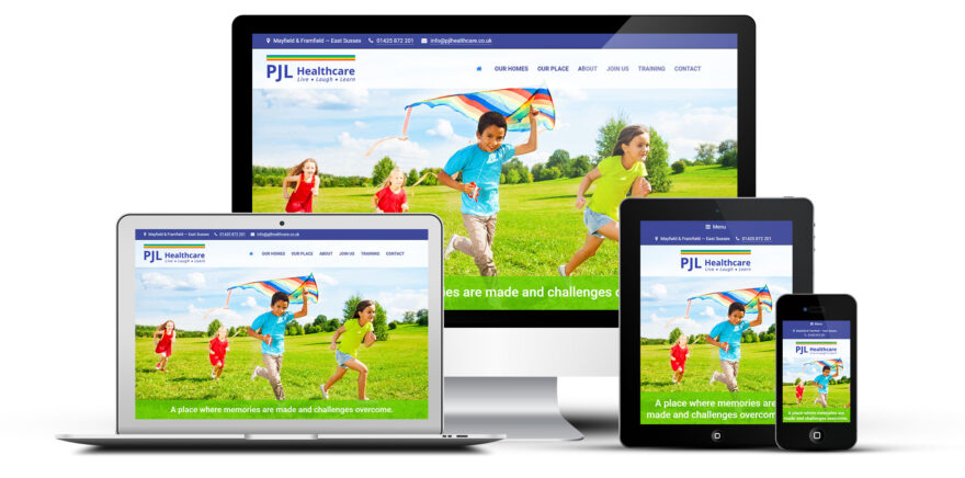
The PJL Healthcare logo incorporates a rainbow design device which we chose to use throughout the website’s design, instead of the more pastel colour scheme of their existing website. By using bright colours, the website instantly has a happy, uplifting feeling, emphasising the type of home environment which PJL Healthcare provides.
We needed to incorporate a reasonable amount of text, to provide the information which local authorities and parents might seek when placing a child. But we didn’t want the website to feel overloaded with words, therefore we used techniques such as ‘accordions’ to hide some text until the user clicks to reveal it.
Knowing it was important to consider children who might be coming to live at the home, we recommended including an “Our place” section, which speaks directly to the young people and uses a slightly different tone of voice.
We wrote the core copy throughout the website. This was done in close cooperation with the team at PJL Healthcare, as it was imperative that the language was both accurate and compassionate. For example, we never refer to the locations as “children’s homes” and always call the residents “young people” rather than “children”.
We provided training to the PJL Healthcare team, enabling them to update the blog posts and job vacancies themselves. Their regular updating of the blog, in particular, gives the website a very current feel. Thanks to our user-friendly set up and training, PJL Healthcare can maintain this without coming to us each time they want to publish something new.
Throughout the build process we were conscious that the website should be accessible to people of all abilities. Therefore, we took steps such as avoiding low contrast colour schemes, and adding ARIA attributes to help assistive technology understand the website.
The result
The resulting website is a vibrant, joyful representation of the services which PJL Healthcare offer.
It contains all the key information about every aspect of PJL Healthcare’s services, however, thanks to the clever design, you never feel that you’re being overloaded with text.
With the careful choice of colours, photography and language, the website perfectly showcases the range of services they offer, without any negative connotations.

Karen Wiles
Marketing Manager
Open Door Digital re-designed our website and we were really pleased with how they took the time to understand the business to come up with a great new look and feel. I would highly recommend using their service.

